
Soccer
Oasis-Inspired Manchester City Jerseys Face Backlash from Fans
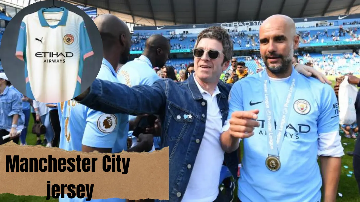
Manchester City recently unveiled their jerseys for the 2024-25 season. Featuring a completely custom font designed by Noel Gallagher, the former lead singer of Oasis. Gallagher, a dedicated Man City fan, handwrote the players’ names and numbers. The team then converted his handwriting into the completely custom font used on the back of the Manchester City jersey.
Also read: Cristiano Ronaldo Son Grows Up: Unrecognizable Next to Dad!
However, the font on the Manchester City jersey has received mixed reactions from fans. With many comparing it to the often-criticized Comic Sans. Some have even joked that they might prefer the widely mocked Papyrus font instead. Fans see the new design as quirky and difficult to read from a distance, leaving some disappointed with the final result.
During Saturday’s match against Manchester United, Manchester City players wore their new jerseys, which quickly sparked online proceedings. Some enthusiasts as compared the font to messy Sharpie scribbles known as “shameful.” On a Man City subreddit, one consumer stated, “I don’t think they might’ve designed a greater hideous font if they attempted.” Even as others likened it to a “knockoff Comic Sans” or stated it “looks like an infant set free with a crayon.”
Also read: Manchester City vs Chelsea: Chelsea Capitalizes on Extra Space for Victory
The team has announced that they will wear these jerseys during Champions League, FA Cup, and Carabao Cup matches. However, they will not use them in Premier League games. Because the league only allows fonts and numbering from a limited selection of approved options.
The Premier League’s kit style guide, introduced last year, emphasizes clear. Bold sans-serif characters are designed to ensure legibility for viewers both in the stadium and on TV. This style choice aims to make it easier for fans to read players’ names and numbers, enhancing the overall viewing experience. The league increased the height of the numbers by nearly 10% to further improve visibility, according to ESPN.
Read more: Ronaldo Out: Al-Nassr vs Inter Miami Showdown Without Star Player
In contrast, the new Manchester City jerseys feature a custom font designed by Noel Gallagher, which has been criticized for its lack of clarity. Fans have compared the font to messy scribbles and even a “knockoff Comic Sans,” suggesting that it falls short of the legibility standards set by the Premier League’s style guide. The creative design seems to have sacrificed readability for uniqueness.
Graphic designers often prioritize clarity and functionality when creating rules, especially for jerseys worn by thousands in large stadiums. When creative choices overshadow these practical needs, it can lead to less effective designs. Perhaps next time, a simpler approach or a larger writing tool, like a bigger Sharpie, might help strike a better balance between creativity and clarity.


Pep Guardiola Benches Ederson: Big Call Ahead of Liverpool vs Man City Clash

Patrick Mahomes vs. Dak Prescott: How Their Contracts Compare

Sophie Cunningham Hopes to Join Forces with Caitlin Clark in the WNBA
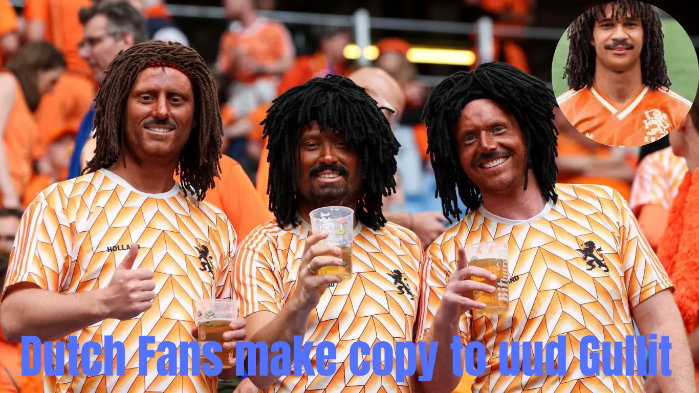
Dutch Fans in Blackface to Imitate Ruud Gullit, One Agrees to Stop

Ex Glamour Model Says Party with England Team Before Euros
Dubai Flood, Rain Turns Desert to Aquarium🌧️🐠
-
 Soccer5 months ago
Dutch Fans in Blackface to Imitate Ruud Gullit, One Agrees to Stop
-
 Soccer5 months ago
Ex Glamour Model Says Party with England Team Before Euros
-
 News8 months ago
Dubai Flood, Rain Turns Desert to Aquarium🌧️🐠
-
 Soccer5 months ago
Argentina vs Peru 2-0 Highlights & All Goals Copa America 2024
-
 NBA6 months ago
Celebrate with the Boston Celtics: Parade and Traffic Updates
-
 Soccer6 months ago
UEFA EURO 2024: Essential Guide and Key Information
-

 Soccer5 months ago
Vinicius Jr Scores Two Goals in Brazil’s Win Vs Paraguay in Copa America 2024
-
 Entertainment7 months ago
The Try Guys’ Journey From Four to Two